During Q4 2010 the Fed implemented the follow-on to quantitative easing we call QE2. This liquidity program is ultimately responsible for accomplishing one of what has become three objectives (maintain price stability, maintain full employment, and now support reflation of US stock market indexes). Obviously the one objective the Fed is succeeding at is reflation of the stock markets. So far, the Fed is not being successful at their two primary objectives. Now a big question is how can US stocks maintain their advance without the rest of the world's participation. Hello Ben. An answer please.
The rest of the developed world is seriously messed up. Consider China with high and climbing food and shelter inflation threatening the massive lower classes, potentially destabilizing the power of the ruling party. Imagine the threat of rising interest rates in China now! In the EU, the challenge is to find agreement of how to save the Euro or accept a serial credit default. Imagine the threat of rising interest rates in the Eurozone now! And Japan is scared spitless that the time is near for the yen to collapse having failed to restore growth in their economy for two decades and borrowing into crisis levels. Imagine the threat of rising interest rates in Japan now! Imagine the threat of rising interest rates in the US now! Mish recently described the desire of central bankers everywhere saying they "want an orderly decline in the Euro to help exports much the same the US wants an orderly decline in the dollar, Brazil wants an orderly decline in the Real, and every country on the planet wants an orderly decline in their currency as well, all so that everybody can increase exports. Mathematically it does not work, and never did." The reality is, this is a Ponzi world and the first one to blink might be the... well this is going to be one interesting year, followed by another.
Economic Observations:
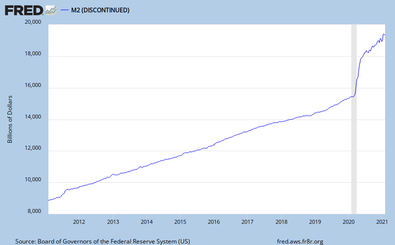
Net seasonally adjusted money supply is increasing. This is usually good for equity markets indicating a pool of cash that could be used for investment. Currently, it might not be so supportive of equities because it might be more of an indication of consumer savings increasing. I'll look at that further on. The graph below is the current ten year chart for M2. M2 includes M1, plus time deposits, savings accounts and non-institutional money market deposits. Money supply is cash both for business and consumers to use, as well as money for banks to lend. If business and consumers prefer to borrow, like in the past twenty years, money supply growth would probably tend to be slow so that disposable income can support growth of debt service requirements.
The total of outstanding credit is contracting, as indicated on the following graph. Creating credit is the fundamental bank service, and it is shrinking.

There is something else importantly wrong, illustrated with the following graph, showing total non-performing loans as a percentage of total loans. Because problem loans are at high levels, banks must create capital to set aside for future losses and that won't help lending grow. This is an alarming trend for lenders. They would be much more comfortable with the level remaining below 2.0%, which still is historically elevated. Instead we see the 'declared' problem exceeds 5% of all loans! What's happening almost weekly since 2008 is that the FDIC is closing banks with high problem loan ratio's and it is assuming the problem loans. That will keep the percentage from growing more on the graph below.

Next, here is the current level of the federal budget deficit, a reflection of all of the financial commitments we have made. This is a concern because it impacts the value of the dollar, interest rates and covertly, the amount of daily political freedom we stand to lose to our government. The chart is illustrating a growing deficit, take a look. The chart is updated to 10/18/2010.
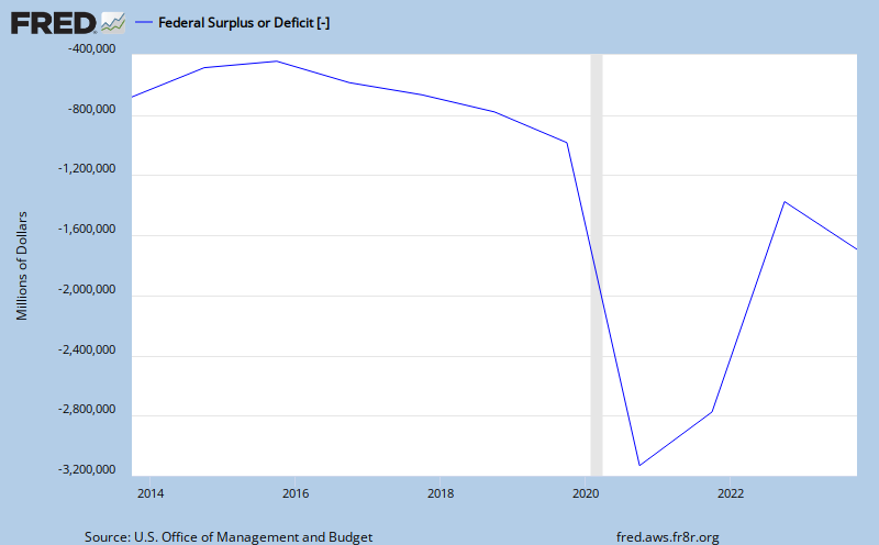
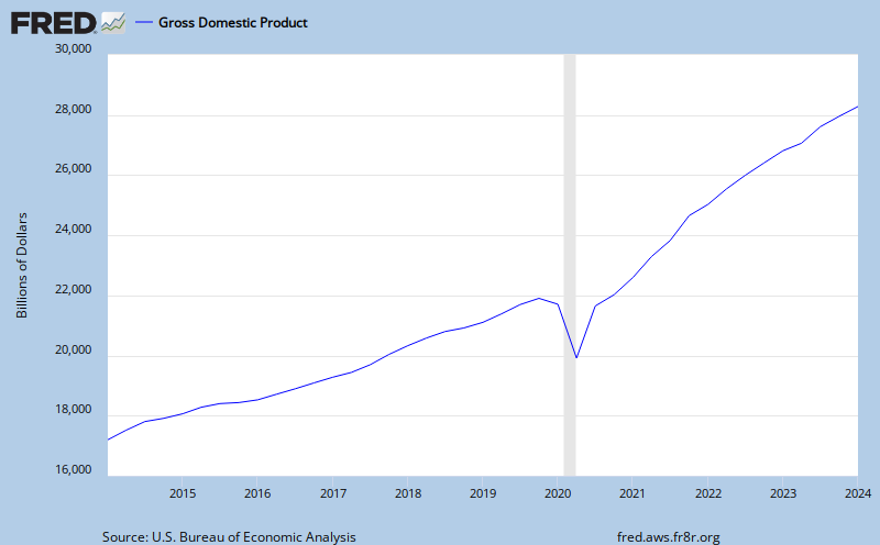
At almost $1.4 trillion dollars, compare the budget deficit to the total annual measured output of our economy, GDP. GDP is the monetary value of all the finished goods and services produced in the U.S.. In other words, how much revenue to cover the the financial commitments we have made. Looks as though the growth of revenue is struggling to maintain.
With our financial system technically collapsing from the weight of a structural debt problem there must signs of a storm on the horizon. The bond market is good barometer of financial conditions and interest rate inflation in particular. Consider the spread between the five year US Treasury Note and the five year Inflation Protected Note. This yield spread is a way to spot bond market concern. If bond investors like the inflation protected feature more, we should see the spread widen, since the five year note is generally less popular than the 10 Yr Bond and requires a lower price, higher yield. A typical five year spread has been 2.20%. The current five year note is yielding 1.92% and the inflation protected note is yielding -0.27%. The spread is currently 2.19%. The yield is also saying there is not very much concern about the dividend paying capacity (credit worthiness) of the issuer, the US Treasury. Yields are low and have been rising in the recently, staying in a trading range, with the US$ index.

Obviously, yields can continue falling. For example, look at the yields in Yen bonds, from Bloomberg, for a wider perspective. The 5 year yield is currently at 0.54%. That is 1.38% below the US 5 year note! Yields probably can go lower in the US.
Here is a look at corporate bond yields and the spread between Aaa and Baa bonds. Risk is OK.

Next, with yields low, are US savers saving? If they are, it could be an indication of less consumer income available for personal consumption expenditures. That matters because the consumer is the machine that runs 68 % of US GDP. The thirty year chart below indicates that personal savings is rebounding to 5.7% as of September 2010. This is good for the economic health of the nation but not good for the stock market. The stock market relies on growth of revenues produced from the consumption of goods and services. An increasing savings rate is a sign of the "slowdown". It might get real slow as more consumers catch on to the seriousness of the crisis we are in, the lack of any real solution or political will here, the risk of full blown deflation is on still the horizon. It may get prefaced by interest rate and price inflation first.

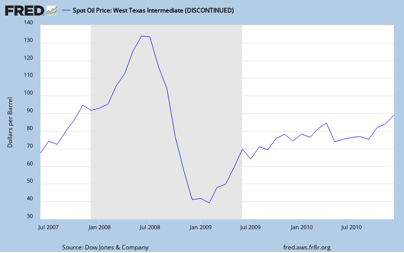
Oil is an embedded cost in GDP influencing the cost of goods and transportation of nearly everything (not internet commerce). Not quite as obvious, as the price of oil changes so does the GDP contribution to reducing the federal deficit. The 1/14/2011 price for West Texas Intermediate (WTI) crude oil on the spot market was $91.54.
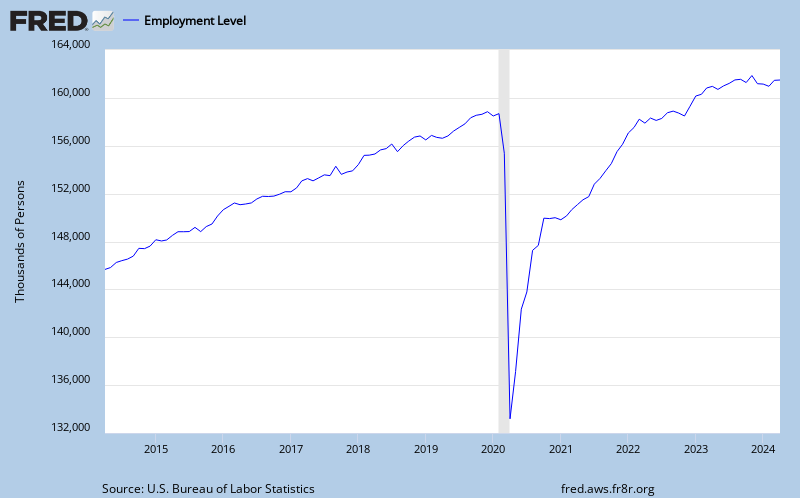
Finally, look at the slowest indicator of economic change, unemployment. The blogger, Calculated Risk, does a thorough job of covering the relationship between the level of unemployment and when we'll enjoy a sustainable recovery in the housing market. It is his premise that "real house prices decline until the unemployment rate peaks - and maybe even decline slightly for a few more years". The following chart illustrates the year over year percent change in civilian employment.
Obviously, the above measures illustrate a weak economy, not a growing one. The greatest risk is that of interest rate inflation. That will create a domino effect through the G-7 economies, all of whom are creating or nurturing a public debt crisis. Rate increases will cause the cost of the debt crisis to rise and that is a road to extinction of the prevailing currency. The textbook prescription is to flood the financial system with liquidity to maintain a cash surplus. That is happening in QE 1 & 2 & 3 & ... The question now being, where is the liquidity going. Some is obviously flowing into foreign markets buying foreign currencies and commodities creating price inflation there and spreading everywhere. Price inflation is a big problem in certain societies of poverty, but lacks the currency killing power of interest rate inflation. Can the currencies be saved? Some may be sacrificed as scapegoats.