In Europe, the government of Portugal has collapsed. The government voted to not accept more austerity measures which was recommended by the former prime minister and his finance minister. This development is expected to lead to a bailout of the country's sovereign external debt by the European Central Bank and/or the IMF. The financial conditions attached to bailouts have been painful so far for Greece and Ireland. Both of those governments are debating how to incorporate the painful bailout conditions or to default on them. Default is immediately easier and politically popular in the countries. China is concerned with internal high and climbing food and shelter inflation threatening the massive lower classes, potentially destabilizing the power of the ruling party. Published reports claim that interest rate increases are on the calendar in China now to slow lending and personal discretionary consumption.
In the US, the Treasury market is finding some strength on a risk-off move recently. The US$ is weak, currently near the 76 mark. New and existing house sales numbers were reported recently by the Commerce Department and are lower than projections. Nationally, median house prices are now at December 2003 levels. Banks, the primary source of credit for economic expansion, both consumer and commercial borrowers, are lending only to prime customers, letting growth of credit remain below trend. Bank closings totalled 11 in January, 12 in February and 3 through March 25, according to the FDIC. Most businesses do not have pricing power, so prices are holding the line so far despite rising commodity prices. Exceptions are businesses with pricing power such as universities, health care services, food and energy producers. Inflation (see Q4 CPI) for gasoline in 2010 came in at 13.8%, the overall energy component at 7.7%, and in the major grocery store food groups, the index for meats, poultry, fish and eggs posted the largest increase at 5.5 percent.
The Federal Reserve is pulling the strings to guide global perception about the strength of the US$. The Fed has no choice but to continue it's zero interest rate policy and money printing practice. They will attempt to support the Treasury market when the primary dealers and global participants back away more than they have now. How the Fed uses it's power may look different and they will call it by another name to put watchers off the scent. But we are talking about a global economy here. Not just the US. Other major economies are directly impacted by the Fed's actions. So they become partners in the deed and will cooperate to the greatest possible extent. This will buy time. The possible time frames are wide ranging from many months to years. Unforeseen events, natural and physical, with financial consequences are wild cards that can, of course, shorten the time frame by changing the delicate balance in place now.
Economic Observations:
Here are recent currency trends for some of the developed economies. These prices are in terms of the foreign currency to the US dollar.


Net seasonally adjusted money supply is increasing. This is usually good for equity markets indicating a pool of cash that could be used for investment. Currently, it might not be so supportive of equities because it might be more of an indication of consumer savings increasing. I'll look at that further on. The graph below is the current ten year chart for M2. M2 includes M1, plus time deposits, savings accounts and non-institutional money market deposits. Money supply is cash both for business and consumers to use, as well as money for banks to lend. If business and consumers prefer to borrow, like in the past twenty years, money supply (M2) growth would probably tend to be slow so that disposable income can support growth of debt service requirements.

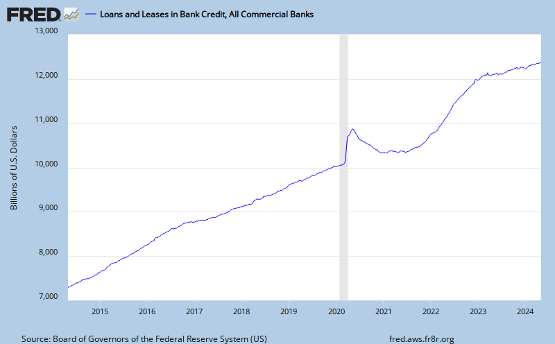
The total of outstanding credit is contracting, as indicated on the following graph. Whether or not you agree that the creating of credit is a fundamental bank service, it is shrinking.
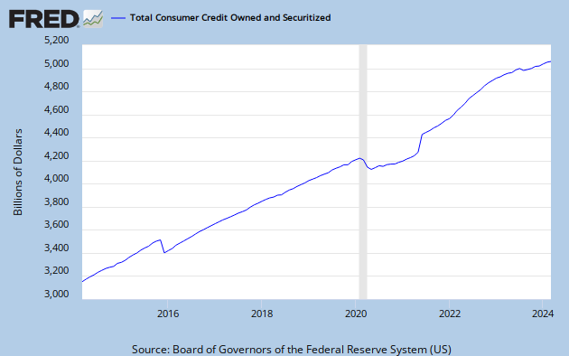
The total of outstanding consumer credit is bottoming, as indicated on the following graph. Will the US consumer return to their pre-crisis spending ways?
The following graph is showing total non-performing loans as a percentage of total loans. Because problem loans are at high levels, banks must create capital to set aside for future losses and that won't help lending grow. This is an alarming trend for lenders. They would be much more comfortable with the level remaining below 2.0%, which still is historically elevated. Instead we see the 'declared' problem exceeds 5% of all loans! What's happening almost weekly since 2008 is that the FDIC was closing banks with high problem loan ratio's and it is assuming the problem loans. More recently, FDIC action has been to put operating restrictions on problem banks forcing their cash flow to problem area resolution. That will keep the percentage from growing more on the graph below.

Next, here is the current level of the federal budget deficit, a reflection of all of the financial commitments we have made. This is a concern because it impacts the value of the dollar, interest rates and, of course, public policy. The chart is updated to 9/30/2010.

At almost $1.4 trillion dollars, compare the budget deficit to the total annual measured output of our economy, GDP. GDP is the monetary value of all the finished goods and services produced in the U.S.. In other words, how much revenue to cover the the financial commitments we have made.It appears the growth of revenue is returning to trend.
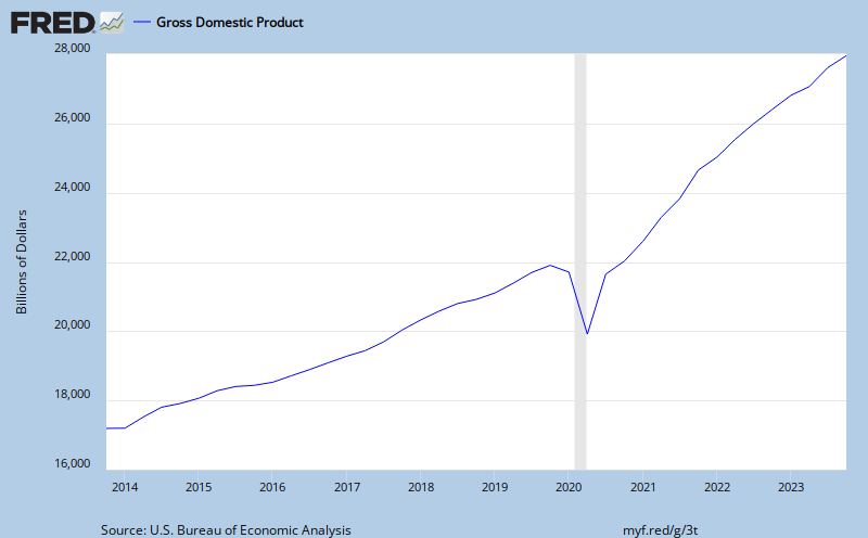
Oil is an embedded cost in GDP influencing the cost of goods and transportation of nearly everything (not internet commerce). Not quite as obvious, as the price of oil changes so does the GDP contribution to reducing the federal deficit. The 1/14/2011 price for West Texas Intermediate (WTI) crude oil on the spot market was $91.54.

With our financial system technically collapsing from the weight of a structural debt problem there must signs of a storm on the horizon. The bond market is good barometer of financial conditions and a gauge for interest rate inflation in particular. Consider the spread between the five year US Treasury Note and the five year Inflation Protected Note. This yield spread is a way to spot bond market concern. If bond investors like the inflation protected feature more, we should see the spread widen, since the five year note is generally less popular than the 10 Yr Bond and requires a lower price, higher yield. The yield is also saying there is not very much concern about the dividend paying capacity (credit worthiness) of the issuer, the US Treasury. The current five year note is yielding 2.25% and the inflation protected note is yielding -0.51%. The spread is currently 2.76%, signalling increasing concern of price inflation. A typical five year spread has been 2.20%. Yields are low and have recently been staying in a trading range.
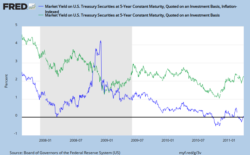

Despite inflation concerns, yields can fall from even the current low levels. For example, look at the yields in Yen bonds, from Bloomberg, for a wider perspective. The 5 year Yen bond yield is currently at 0.60%. That is 1.65% below the US 5 year note.
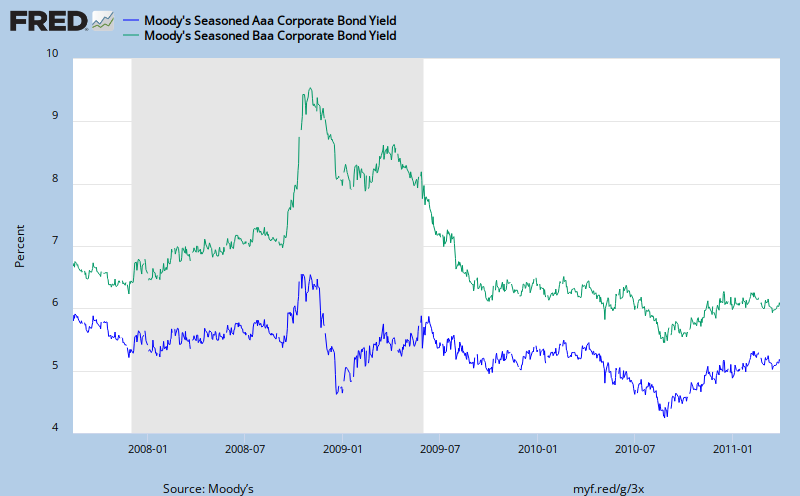
Here is a look at corporate bond yields and the spread between Aaa and Baa bonds. Risk is OK.
Next, with yields still low, are US savers saving? If yes, it could indicate less disposable income available for personal consumption expenditures. That matters because consumer consumption is the machine that runs nearly 70% of US GDP. The ten year chart below indicates that personal savings is rebounding to 5.9% as of February 1, 2011. This rate is good for the long-term economic health of the economy, but not good for the stock market and businesses relying on personal consumption expenditures. An increasing savings rate is a signal of an economic growth "slowdown".

Finally, look at the slowest indicator of economic change, unemployment. The blogger, Calculated Risk, does a thorough job of covering the relationship between the level of unemployment and when we'll enjoy a sustainable recovery in the housing market. It is his premise that "real house prices decline until the unemployment rate peaks - and maybe even decline for a few more years". The following chart illustrates the year over year percent growth in civilian employment.

Obviously, the above measures illustrate a recovering, still weak economy, not a strong, growing one. The greatest risk according to mainstream media is that of interest rate inflation. That could be triggered by a strengthening dollar or a self-sustaining recovery, neither one being mutually exclusive. Rising interest rates in the US will create a domino effect through the G-7 economies, most of whom are creating or nurturing their own structural public debt problems. Rate increases will cause the cost of the debt to rise and that is the beginning of a road to extinction for the prevailing currency. The textbook prescription is to flood the financial system with liquidity to maintain surplus cash (monetary base). That is what is happening with QE 1 & 2 & 3 & ... The question now is, will the Fed maintain the expectation of QE extensions. It seems to me, as I have posted before, the zero interest rate policy is here for a while longer and quantitative easing is too. The unforeseen change is what QE3 will look like. My guess is that there will be a new partner in the money printing scheme. It might be the municipal bond market or another sovereign willing to sell some treasury securities for a promise to support US asset markets. There are so many potential players and angles in this scheme, that keeping it the same is just going to provide more time for Fed watchers to clear the fog. See One Eye on the Fed: Dual Mandate is Camouflage. Greater visibility, or predictability, minimizes the Feds influence of market psychology. As long as they can influence psychology, they will have the markets believing they are now benefactors of the TBTF policy. The Fed is accomplishing its mandate, no matter what you think it is. Now, don't we have to ask ourselves, is this really a way to run an economy? All the power in the hands of one person? Really?