Observations:
Net money supply has increased. View the current five year charts for M1 and M2 below. I am using these money supply measures knowing there are several others, which in my opinion make the same point. However, some analyst's are very opinionated about the use of one measure over another. If anyone has an opinion different than mine, I welcome your comment about this.

Click on charts for larger view

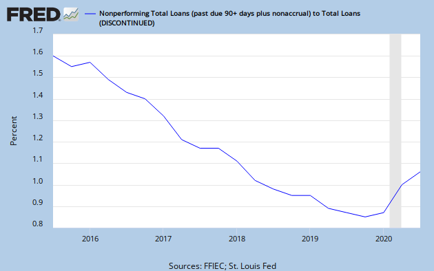
Despite this increased money supply, lending is contracting as indicated on the following graph;

Next to be illustrated is the current level of the federal budget deficit. This is a concern because it impacts the value of the dollar, the interest rate outlook and amount of political freedom we stand to lose to our government.


Nearly 70% of GDP is the CONSUMER. Us. Personal consumption spending makes up slightly less than 70% now of the GDP number, seen above as $14.2 trillion dollars. Also alarming, we can see that our government has increased the national debt so that now, we must payout more than 10% of our annual GDP for debt repayment, if we are repaying. We aren't. We'll borrow that too. This helps me understand why other nations are publicly saying, we are not happy to participate in your economic denial game much longer? You are curiously reckless! (technical jargon).
Let's now consider the spread between ten year US Treasury Bonds and the ten year Inflation Protected issue, without graphs. The spread is a way to spot bond market trends. If investors like the inflation protected feature more, we should see the spread widen, since the ten year bond is less popular and requires a lower price, higher yield. The five year average spread is 2.20%. The current ten year constant yield bond is yielding 3.80% and the inflation protected bond (issued on 7/15/2009) is yielding 1.40%. The spread has widened to 2.40%, the widest over the year I have observed this spread. This indicates to me investors are less concerned about inflation in the future at this moment, than something else, like the weakening dollar. I know it is not this simple. What do you think?
Oil is an embeded cost in our ability to create GDP. It influences the cost of goods produced and of course transportation of everything. Not quite as obvious, as the cost of oil changes, so does the contribution to our goal of reducing the federal deficit. Higher oil costs reduce the the amount we can apply against the deficit. Recent prices of crude oil on the spot markets are $76.83 for West Texas Intermediate (WTI) and $75.15 for Brent barrels. The following graph is taken from the U. S. Energy Information Administration (2009/12).

Finally, I look at the slowest indicator of economic change, unemployment. The widely read and anonymous blogger, Calculated Risk, has done a thorough job of covering the relationship between the level of unemployment and when we'll enjoy a sustainable recovery in the housing market. It is his premise that "real house prices decline until the unemployment rate peaks - and maybe even decline slightly for a few more years".
Here is a brief history of the often reported unemployment rate, known as the U-3 rate, for the past five months. July 2009 - 9.4%; Aug 2009 - 9.7%; Sept 2009 - 9.8%; Oct 2009 - 10.2%; Nov 2009 - 10.0%. And here is the less often but more widely focused unemployment rate, known as U-6. July 2009 - 16.3%; Aug 2009 - 16.8%; Sept 2009 - 17.0%; Oct 2009 - 17.5%; Nov 2009 - 17.2%. The source for this is the US Bureau of Labor Statistics, Table A-12, Alternative measures of labor underutilization report.
That's all the research for today. I'll keep reviewing what I look at as conditions change. And I'll leave you to use the information as you'd like to, draw your own conclusions. Let me know what you would like see in addition and explain why. That way, I can be more certain about what to look for. Scanner