Observations:
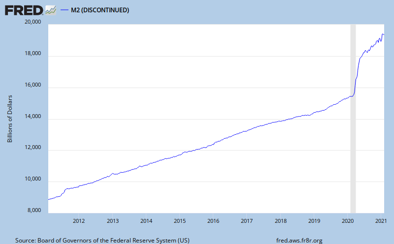
Net seasonally adjusted money supply has increased. This is usually good for equity markets indicating a pool of cash that could be used for investment. Currently, it might not be so supportive of equities because it might be more of an indication of consumer savings increasing. I'll look at that further on. The graph below is the current ten year chart for M2. M2 includes M1, plus time deposits, savings accounts and non-institutional money market deposits. Money supply is cash both for business and consumers to use, as well as money for banks to lend. If business and consumers prefer to borrow, like in the past twenty years, money supply growth would probably tend to be slow so that disposable income can support growth of debt service requirements. That appears to only be happening recently.
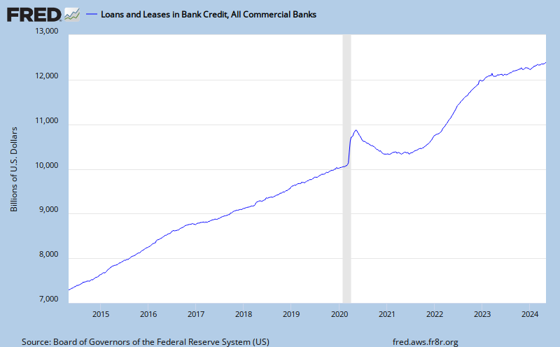
Despite this lower growth of money supply, the total of outstanding credit is contracting too, as indicated on the following graph. It might be that money supply is being tapped to reduce loan balances, including charge-offs at financial institutions. Creating credit is the fundamental bank service, and it is shrinking.
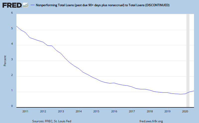
There is something else importantly wrong here. It is illustrated with the following graph, showing total non-performing loans as a percentage of total loans. Because problem loans are steadily increasing, banks must set aside capital for future losses and that won't help lending grow. This is an alarming trend for lenders. They would be much more comfortable with the level remaining below 2.0%, which still is historically elevated. Instead we see the 'declared' problem exceeds 5% of all loans! What's happening almost weekly since 2008 is that the FDIC is closing banks with high problem loan ratio's and it is assuming the problem loans. That will keep the percentage from growing more on the graph below.
Click on graph for a larger image.
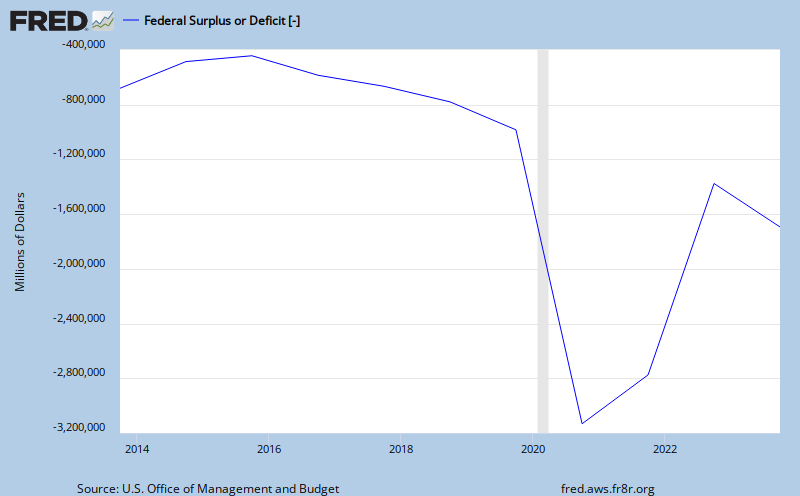
Next, here is the current level of the federal budget deficit, a reflection of all of the financial commitments we have made. This is a concern because it impacts the value of the dollar, interest rates and covertly, the amount of daily political freedom we stand to lose to our government. The declining trend is illustrating a growing deficit, take a look. The chart is updated to 3/8/2010.
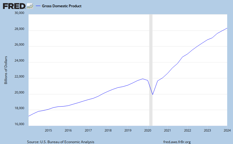
At $1.4 trillion dollars, compare the budget deficit to the total annual measured output of our economy, GDP. GDP is the monetary value of all the finished goods and services produced in the U.S.. In other words, how much revenue do we have for all of the financial commitments we have. Looks as though the growth of revenue is struggling to maintain. To me, this is currently a no growth picture. Personal consumption spending makes up slightly less than 70% of the GDP number, seen below. The national debt service is now more than 10% of our annual GDP.
With our financial system technically collapsing and the national debt problem there must signs of a storm on the horizon. The bond market is good barometer of financial conditions. Now consider the spread between the five year US Treasury Note and the five year Inflation Protected Note. This yield spread is a way to spot bond market concern. If bond investors like the inflation protected feature more, we should see the spread widen, since the five year note is less popular and requires a lower price, higher yield. A typical five year spread has been 2.20%. The current five year note is yielding 1.67% and the inflation protected note is yielding 0.26%. The spread is currently1.41%. This indicates to me investors are less concerned about inflation in the future at this moment. The yield is also saying there is not very much concern about the dividend paying capacity (credit worthiness) of the issuer, the US Treasury. Yields are low and have been falling.
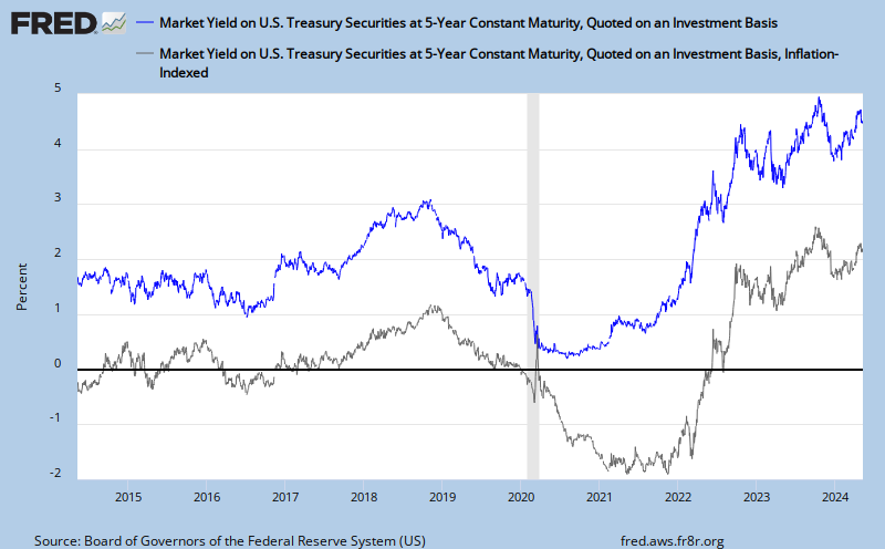
Obviously, yields can continue falling. Let's look at the yields in Yen bonds from Bloomberg for a wider perspective. The 5 year yield is currently at 0.36%. That is 1.31% below the US 5 year note! Yields probably can go lower in the US.
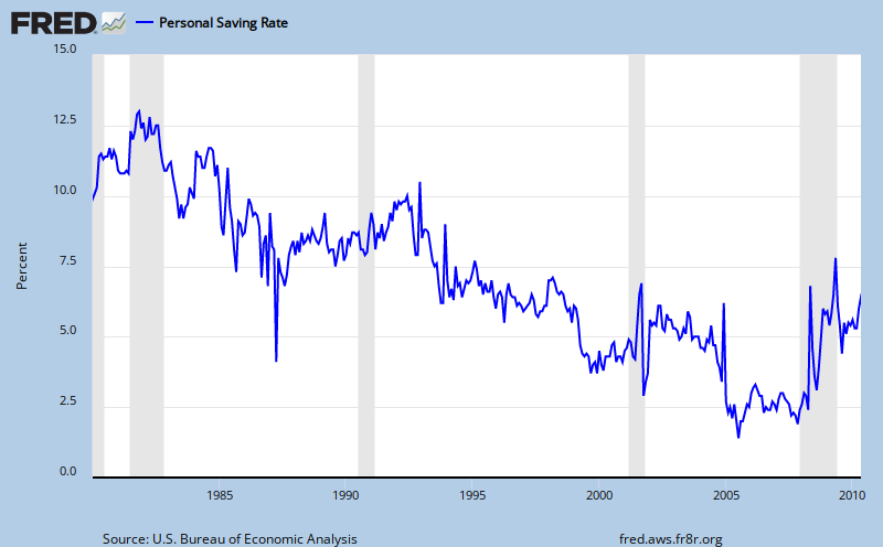
Next, with yields low and potentially going lower, are US savers saving? If they are, it would be an indication of less consumer income available for personal consumption expenditures. That matters because, as we know, the engine that runs US GDP is the consumer. The thirty year chart below indicates that personal savings is rebounding to 4.0% as of May 2010. This is good for the economic health of the nation but not good for the stock market. The stock market relies on growth of revenues produced from the consumption of goods and services. An increasing savings rate is a sign of the "slowdown". It might get real slow as more consumers catch on to the seriousness of the crisis we are in, the lack of any real solution or political will to call for austerity here, the risk of full blown deflation is on the horizon.
Oil is an embedded cost in GDP. It influences the cost of goods produced and transportation costs of everything. Not quite as obvious, as the price of oil changes, so does the contribution to reducing the federal deficit. Higher oil costs reduce the the amount of GDP we can apply against the deficit, as well as everything else. The 7/16/2010 price for West Texas Intermediate (WTI) crude oil on the spot markets is $75.37. The following graph is from the U. S. Energy Information Administration.

Finally, look at the slowest indicator of economic change, unemployment. The blogger, Calculated Risk, has done a thorough job of covering the relationship between the level of unemployment and when we'll enjoy a sustainable recovery in the housing market. It is his premise that "real house prices decline until the unemployment rate peaks - and maybe even decline slightly for a few more years".
Here is the most reported unemployment rate, the U-3 rate. June 2009 - 9.7%; Feb 2010 - 9.7%; March 2010 - 9.7%; April 2010 - 9.9%; May 2010 - 9.7% and June 2010 - 9.5%. And here is the more widely focused unemployment rate, known as U-6. June 2009 - 16.8%; Feb 2010 - 16.8%; March 2010 - 16.9%; April 2010 - 17.1%; May 2010 - 16.6% and June 2010 - 16.5%. The source for this is the US Bureau of Labor Statistics, Table A-15, Alternative measures of labor underutilization.
Finally, the graph that follows is from the Philadelphia Fed showing the results of their regional phone survey of manufacturing executives who are asked about their company's business outlook. A positive index level reflects optimism. The current index level suggests waning optimism.

In conclusion, I want to allocate strategically for a stagflationary economy. Stagflation because that is what we get from underlying deflation and a government bound and determined to reflate the economy. Neither one is going to back down. Deflation wins because it is the embedded or natural condition in our economy. My asset allocation is to be long equities (20%) involved in commodities and metals (gold mining, oil and natural gas, alt energy) for their high beta and long-term appeal, offset with an inverse equity position of equal percentage (20%) to counter the high beta in the long positions, and the balance of the portfolio allocated between high quality, short duration corporate bonds (25%), intermediate duration high quality corporate bonds (15%), foreign government bonds (15%) owned in local currencies, and gold bullion or coins (5%). Individual allocations will vary, based on the risk profile of the investor. Scanner
P.S. After posting this article today, I found an interview with Bill Gross that adds to my analysis. Here are a few of the Q's & A's from the interview.
So which is the bigger risk now -- inflation or deflation?
Our investment committee has sketched out four possible scenarios. Scenario A is that the global economy rebounds back to past levels of high growth. B is just a decent rebound. C is that new normal -- half-sized growth. And D is deflation, debt, destruction. I'd say we're at a C -- right now. We believe in the new normal, but what we're seeing in Europe puts the minus on that C grade.
What does the "new normal" mean for our readers?
Instead of 10% returns for stocks, look for five or so. And instead of the past 20 years' returns on bonds, which are actually better than stocks -- close to double digits -- it's 4% going forward. So that's what the new normal is. And it's based upon the primary assumptions of a deleveraging of the private sector and the public sector being limited in what it can spend.
If stocks might return just a percentage point or two over bonds, does that justify the risk?
Barely.